Watercolors

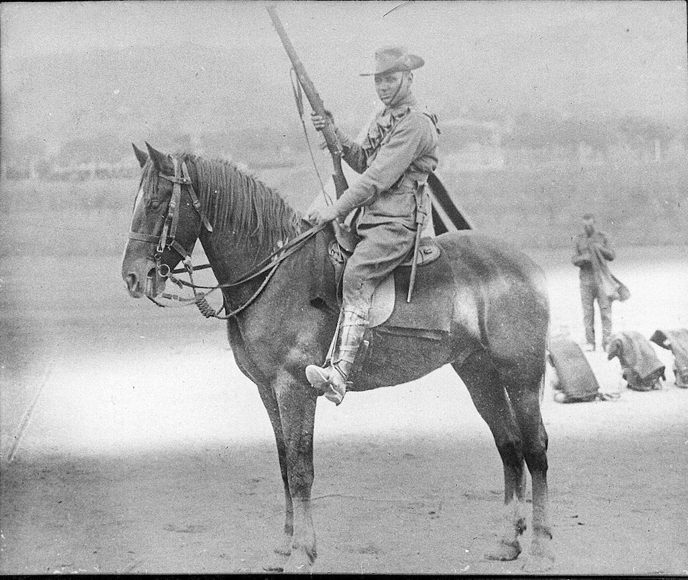
Not having an artistic bone in my body, I hesitate to comment as to the proportion, however I do agree that the horse looks somewhat "light on" in the rear which my lead to the illusion that it is further away. There is also the matter of the rear hoof being higher indicating that it is further away.

I also think that regardless of the original, it might help if the front feet were pulled back a bit as it looks like he is propping (refusing to move forward) and at least part of another leg were visible as the present view gives me the distinct impression that the horse only has two legs. A mounted horse standing absolutely "dead square" is a fairly rare sight.

I like the picture but I agree that there is just something that does not seem right about the horse but I can not put my finger on what it is, I agree about seeing another leg I was thinking though that the back leg almost looks as though it is the "far side" leg.
 
Like yourself, I can't get past the horse's general stance, there appears to be something "out of kilter' with it.

My main problem in critiquing the horse is that I know I couldn't do anywhere as well myself, yet I still feel there are problems with it.

I guess it's a bit like the question thrown at Forbes Carlyle, Australia's most well known swimming coach in the 1950's, when a reporter asked him, "What gives you the qualifications to coach Australia's swimming team, you can hardly swim a stroke yourself"? To which he answered, "Those who can, do,... those who can't teach others"

Implying that one does not necessarily have to be able to do something oneself to see the problems in the work of others.
 
I completely agree I have absolutely no artistic talent but I don't think that is a requirement to determine what is essentially physical mechanics.

Here is a similar photograph and what I think it shows is the importance of seeing at least 3 legs of the horse as I think it is what gives the picture its depth perception.
3806125138_5bee13ee1b_m.jpg
 
Another larger image.

It is of Hermann "Herb" Steike, a local Blacksmith taken at Beersheba. His mount is typical of Australian "Walers", a heavier style of horse preferred by Australian Mounted Infantry troops, whereas Officers had "Chargers" which were of a lighter and more refined type, more like that shown in your photo.

HerbSteike_zps5b834857.jpg
 
Last edited:
Here is a sketch of a man wearing modern body armor (Brewster Field Armor - 1917)

BrewsterArmor_zps920943e4.jpg

I like this picture though as it is very similar to the photograph...

brewster-body-armor-1917-18.jpg


It really amazes me how aspects of WW1 were just such a throw back almost to medieval times.
 
Here is a similar photograph and what I think it shows is the importance of seeing at least 3 legs of the horse as I think it is what gives the picture its depth perception.
3806125138_5bee13ee1b_m.jpg

I agree - even though my subject picture only shows two legs, I think I can finagle a third to give it some depth.

MountedTrooper1_zpseeeb6e73.jpg
 
Umm I am not sure what to make of that and without seeing the original picture it is hard to judge but the helmet makes me think of Charlie Brown for some reason.
 
The funny thing is that the detail is spot on the only thing I have trouble with is the helmet, I had wondered whether he was a fireman as they had a much deeper helmet.

Yeah - the more I look at it the more that helmet looks flat.

Here's a cartoon I've been working on. The helmets seem a little better. I'll just keep practicing.

CryforHelp_zps24a780ec.jpg
 
Part of the problem is that the "Coal Scuttle" or Stahlhelm is the iconic "German" identifier so that is the bit that has to be right in order to convey the image of the WW1/2 soldier.

In the second image it is pretty good but it is just wrong in the first image, the unfortunate part is that you have the detail of the uniform down well especially the belt, ammo pouches and grenade but the helmet turns it from a good recreation into a Charlie Brown comic.

There is some wiggle room with the uniform but the helmet has to be dead on (or it's not). For a cartoon this may be adequate but I want my sketches to be a higher quality. I'll just have to be more careful with the detail going forward.
 
There is some wiggle room with the uniform but the helmet has to be dead on (or it's not). For a cartoon this may be adequate but I want my sketches to be a higher quality. I'll just have to be more careful with the detail going forward.

I hope I am not over the top with the criticism as I don't really mean to be especially since my skill level never really got past the colouring book stage.
 
I hope I am not over the top with the criticism as I don't really mean to be especially since my skill level never really got past the colouring book stage.

Absolutely not - I like criticism and I appreciate yours; how else am I going to improve?
 
Back
Top